The
Club Hotel
Branding, Print
Designed at Uberbrand
Illustrations: Corbin Nash
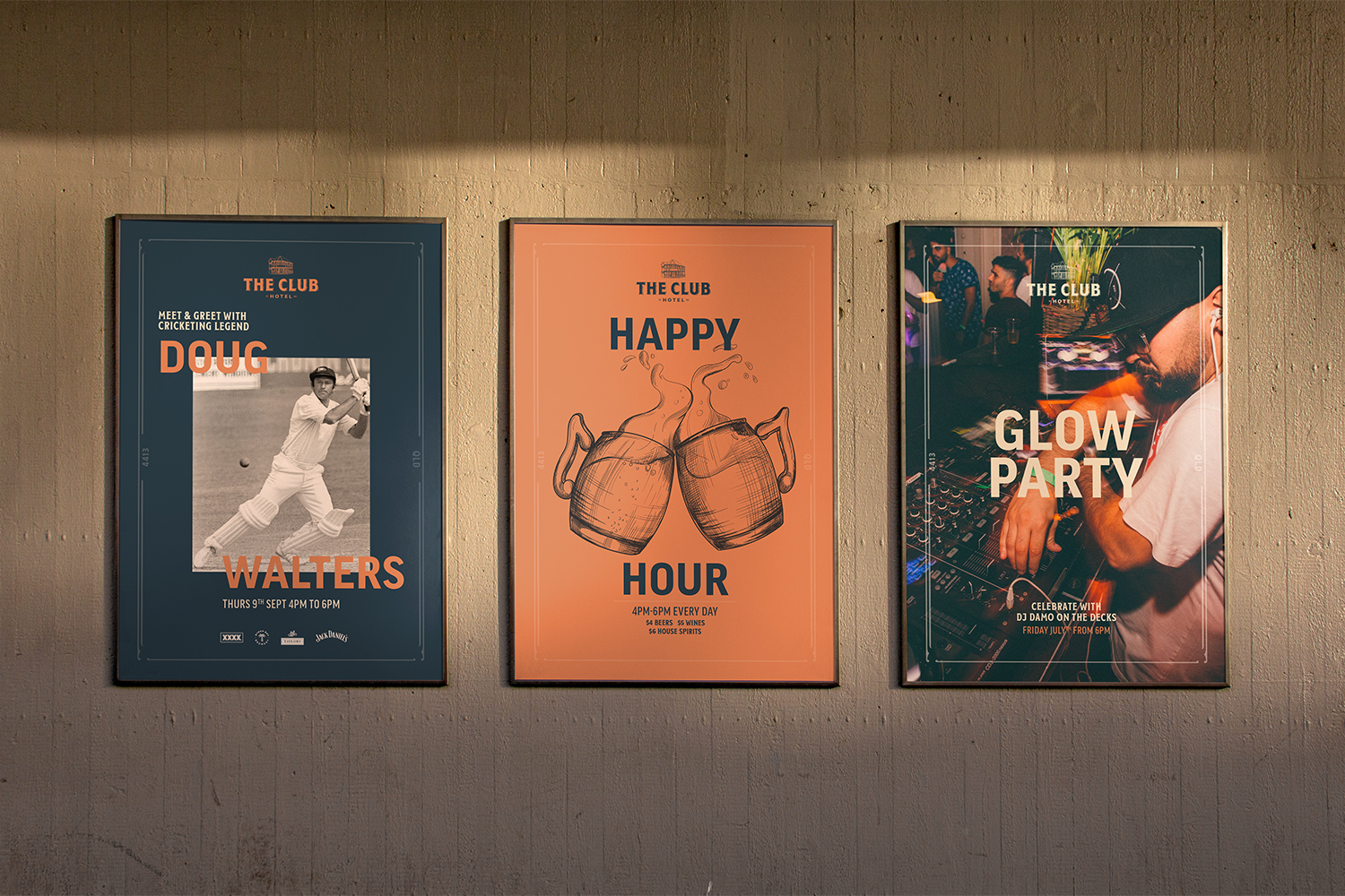
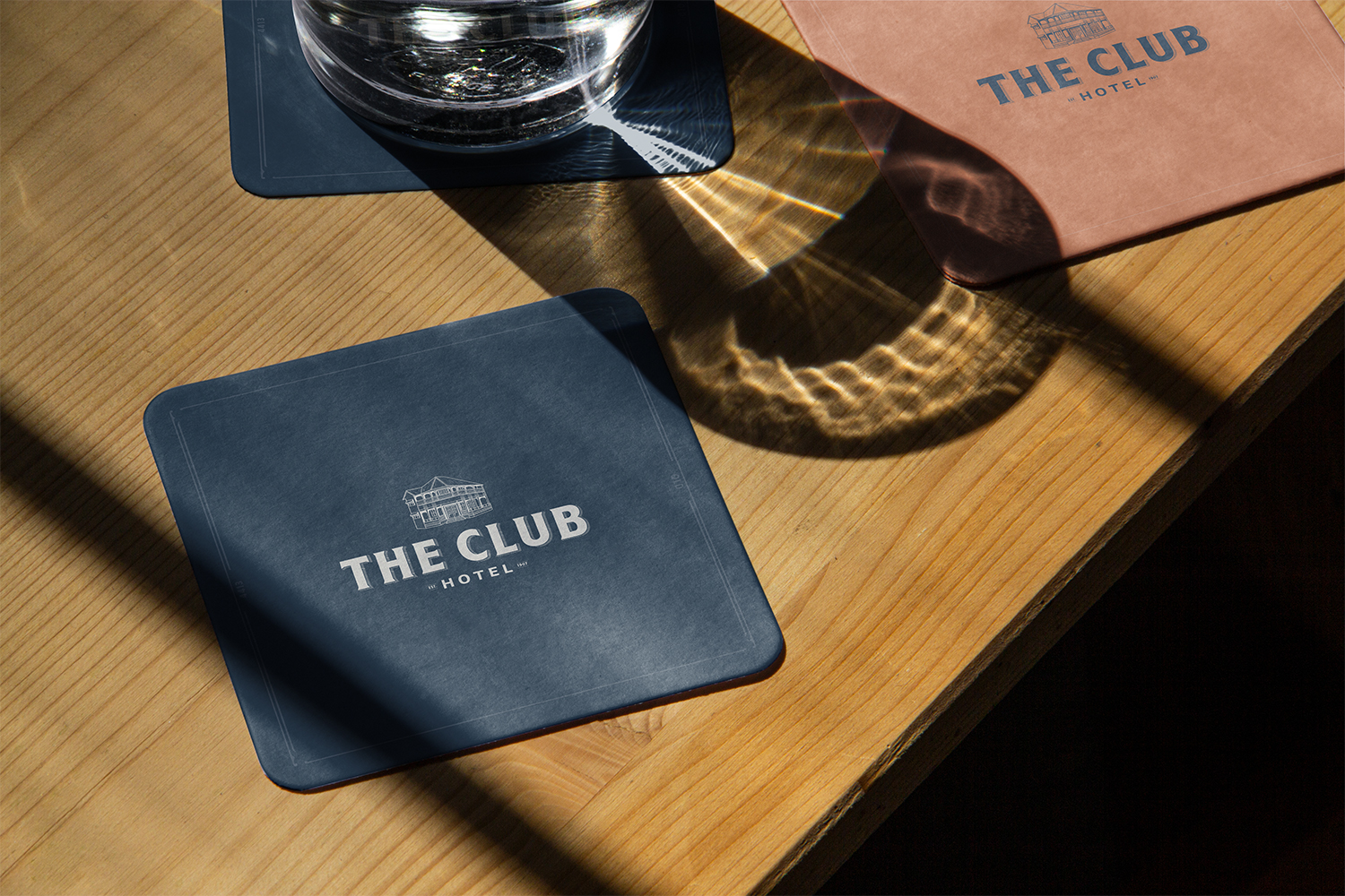
The longest-standing pub in Chinchilla, 4 hours west of Brisbane, The Club Hotel had recently been purchased by the Waymark Hospitality Group. They needed a new identity, following the brand architecture of the WHG family of venues across the country.
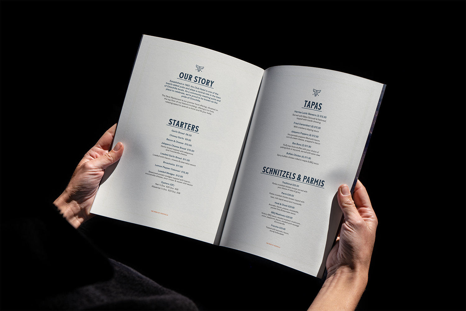
Looking for an icon that best represented the pub and Chinchilla itself, Corbin Nash was engaged to create an illustration of the building itself, having stood tall since 1907. Inspired by early 20th century hand-painted signs and the architectural details of the building itself, further brand elements were created using a dark blue and rust colour palette, honouring the working-class heritage of the town.


The Club Motor Inn
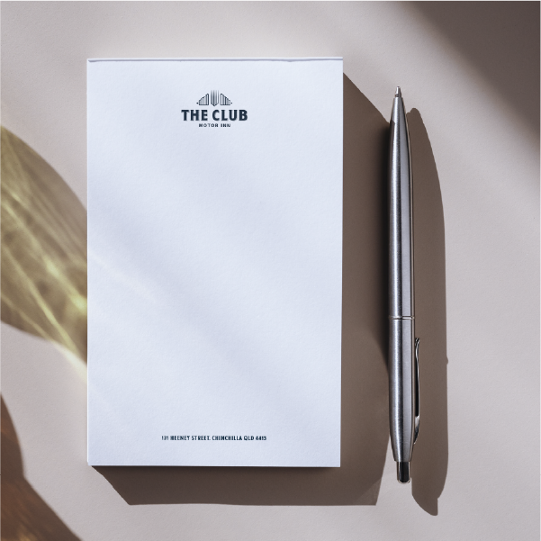
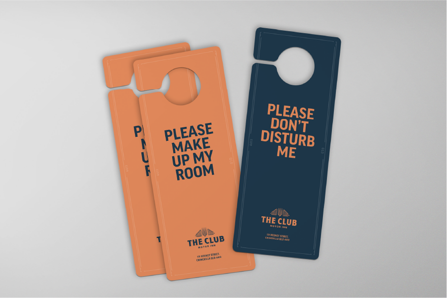
As part of the WHG’s venue strategy, they looked to incorporate the neighbouring Motor Inn within The Club brand. Taking a cue from the heritage balcony facade of the main building and classic car details, given it was a motor inn, Corbin Nash was once engaged to create a venue icon that would be paired with similar type treatment and colour palette to the pub to create a harmonious and integrated brand.
