MoneyMe
Branding, Print, Digital, OOH
Designed at Uberbrand
Motion Design: Ash Carter
Australia’s leading non-bank, the ASX listed fintech MoneyMe wanted to be the number one challenger brand in the country but was held back by an outdated and inflexible brand. Underpinned by the idea of ‘Democratising Opportunity’, the new brand identity was bold, punchy and loud - perfect for a company that wanted to take on the current legacy brands.
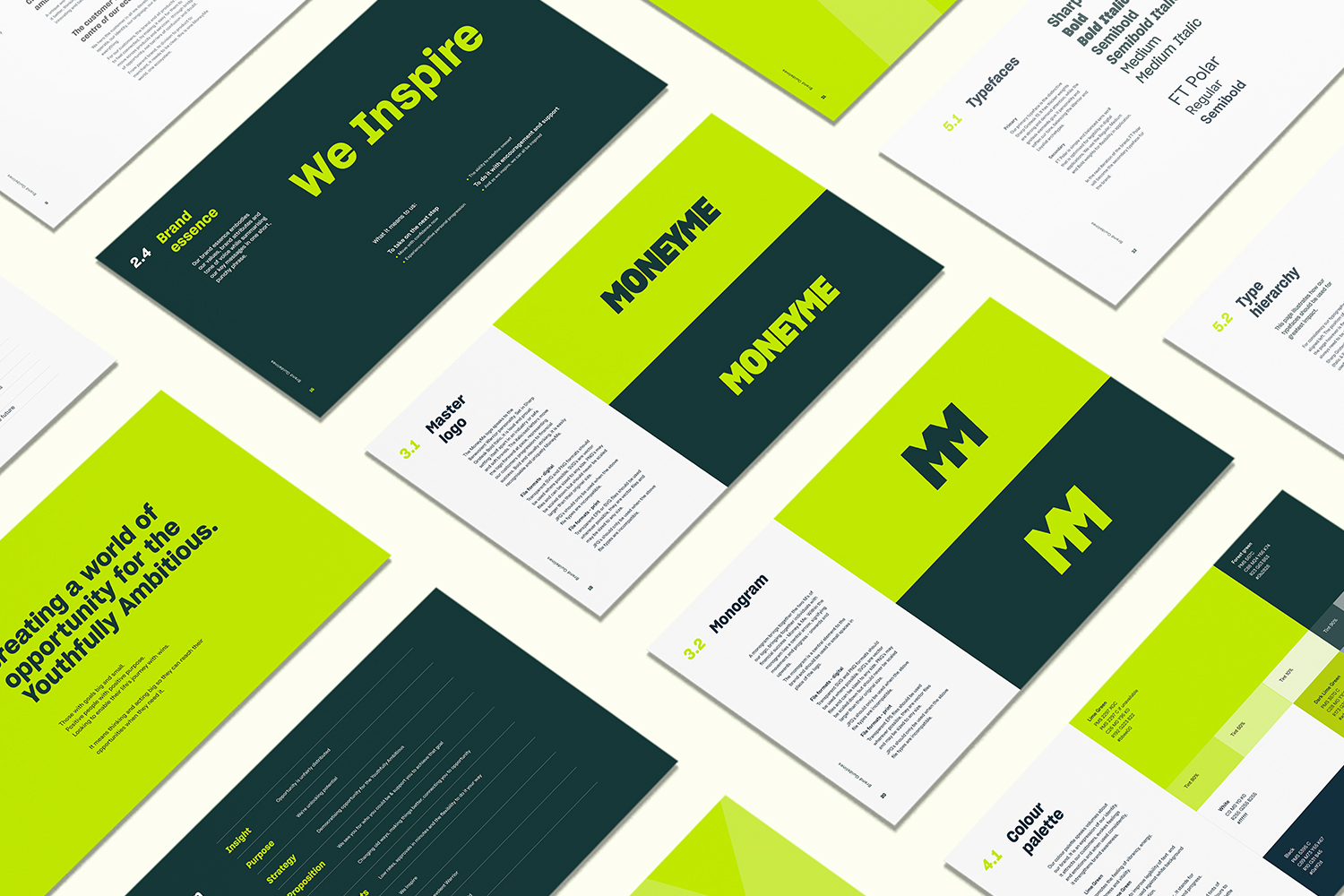
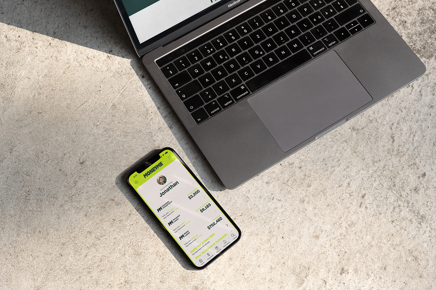
Building from the overarching idea of ‘democratising opportunity’, the logo is inspired by typograpby of protest signage - strong and commanding. With the speed of approvals being a key differentiator in the market, italics were used to suggest movement and rapid pace. The logo is able to be condensed down into a simple ‘MM’ monogram that would become shorthand for the brand and allowed it to flex when using sub brands like AutoPay and the Freestyle Virtual Card.
Hidden within the monogram was an arrow, taking off upwards. With the research showing many of MoneyMe’s customers used their credit as a way of improving their life, like tertiary education or starting a new business, the arrow represented the moment their life took off, boosted by MoneyMe.

Launch Campaign
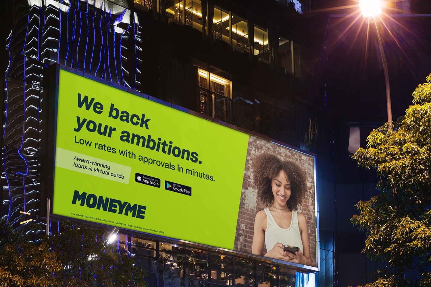
With their new brand identity in check, the MoneyMe team launched an all-out OOH campaign across the country. With limited existing brand awareness, messaging need to be clear and upfront with their value proposition and have prominent logo placement.
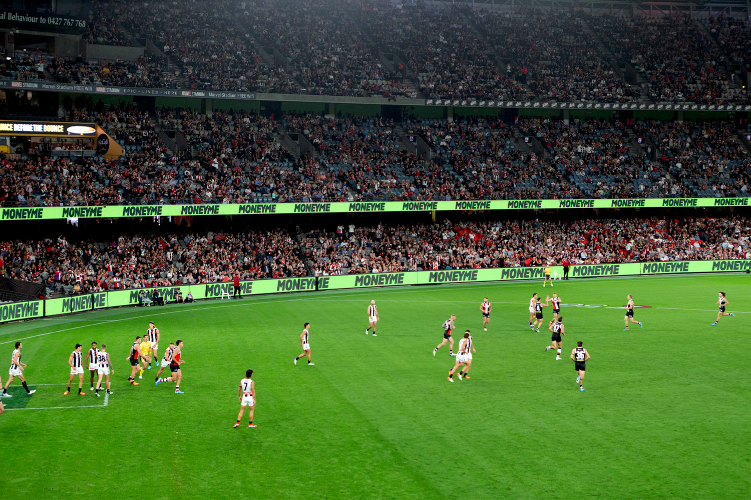
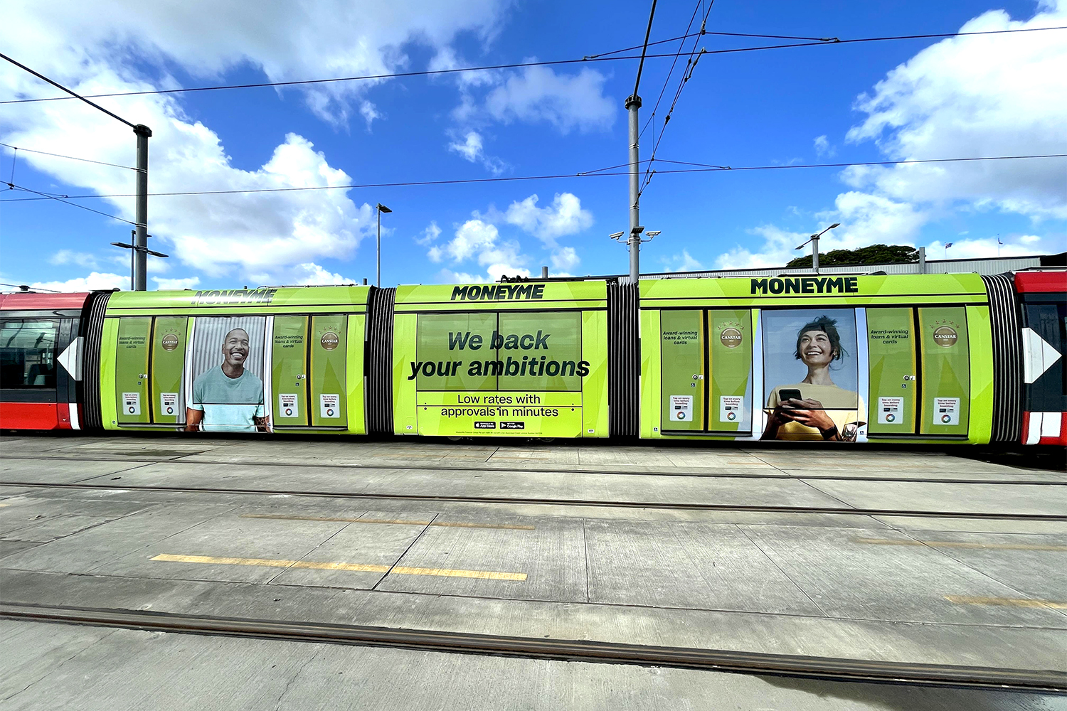
Over 1500 pieces of artwork were deployed across the 6 months from buses and bus stops to billboards and street furniture. The campaign also included noticeable sites like the steps at Central Station & Southern Cross Station, sporting venues like the MCG and a tram in Sydney.
