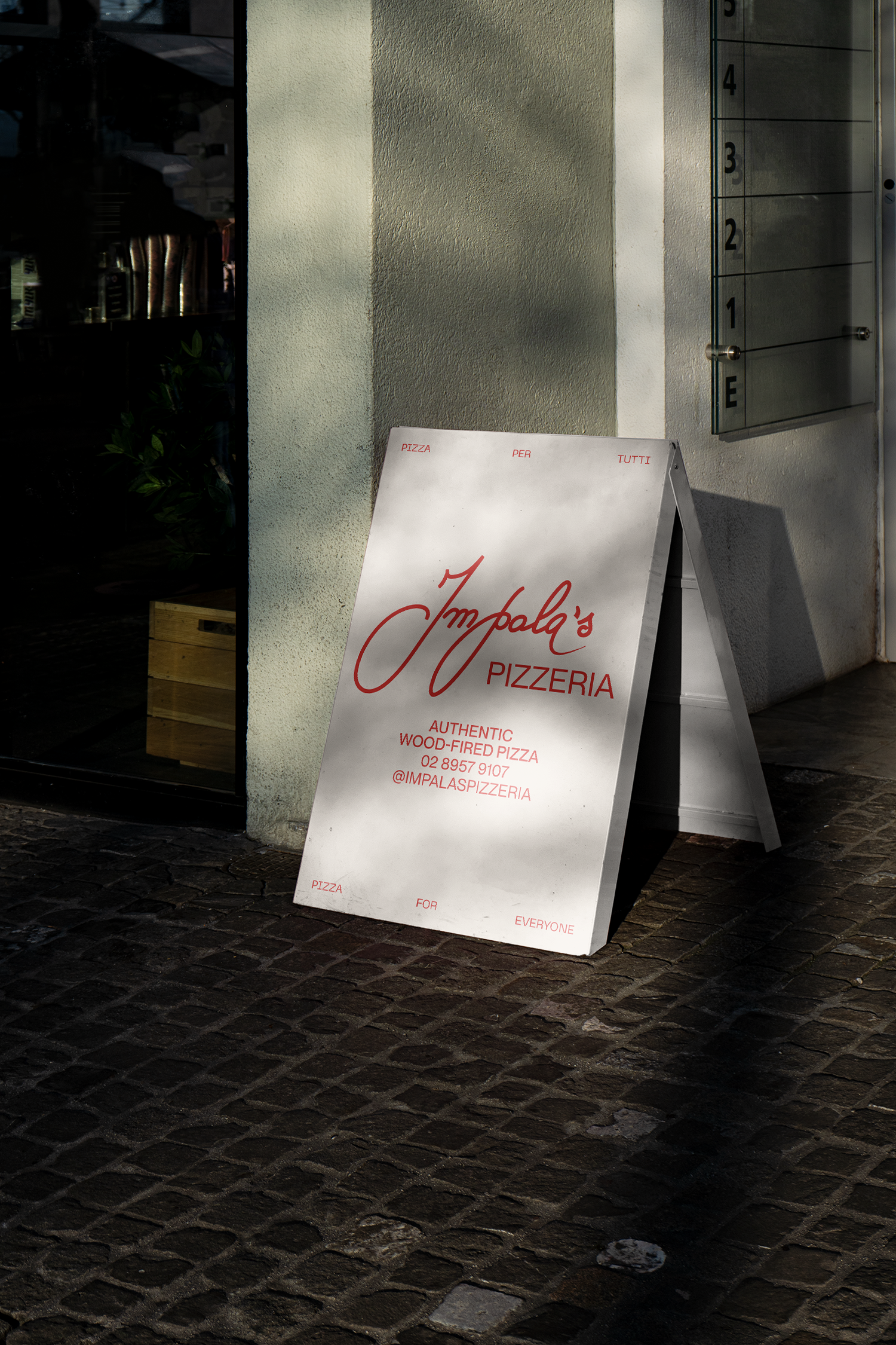
Impala's Pizzeria
Brand Evolution, Signage, Social,
Digital, Print
Freelance Client
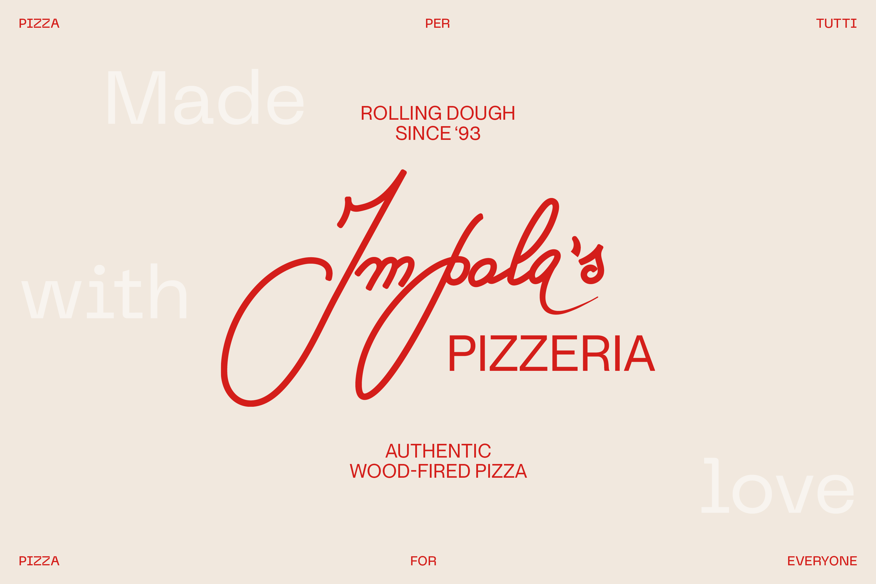
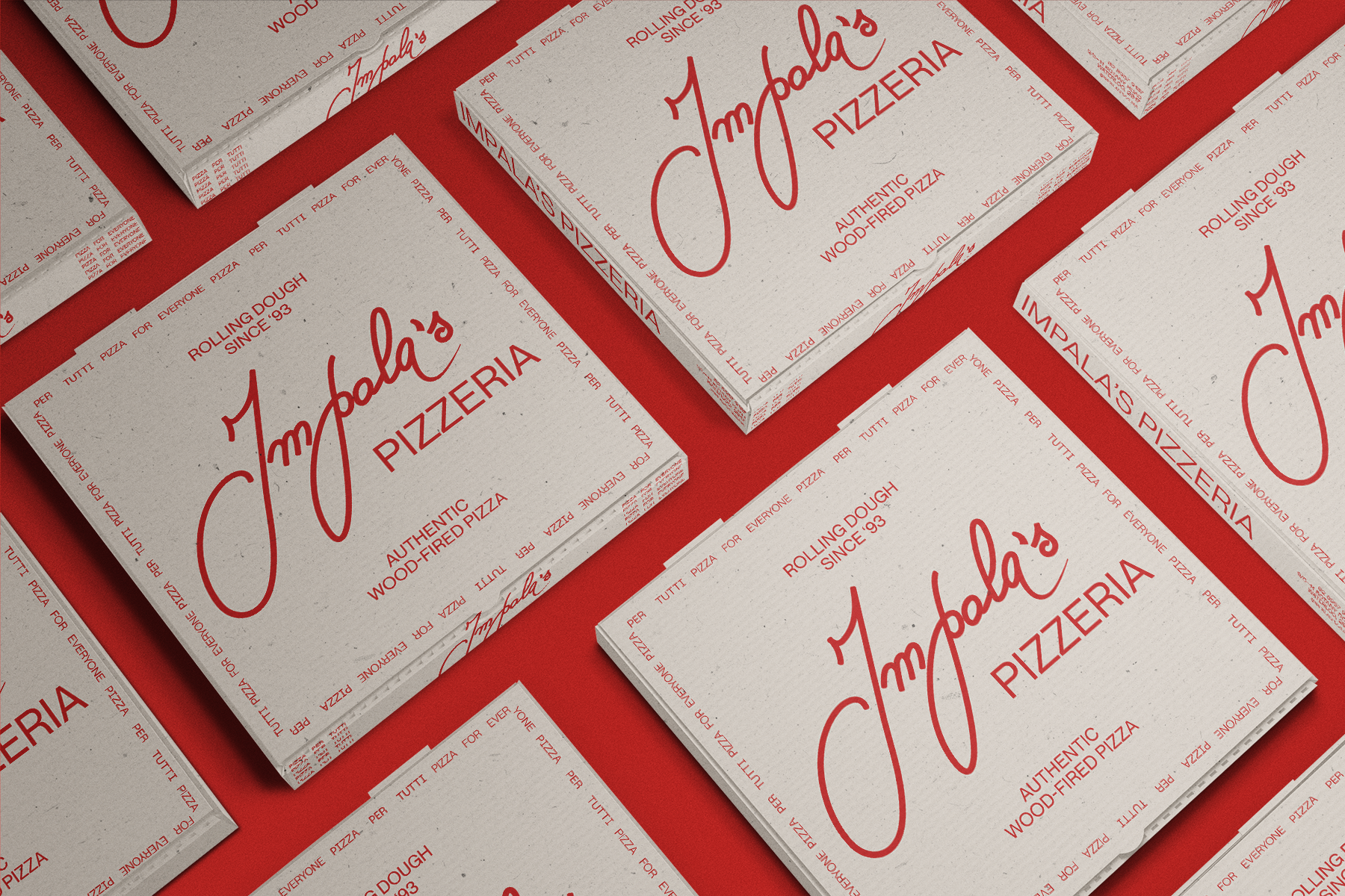
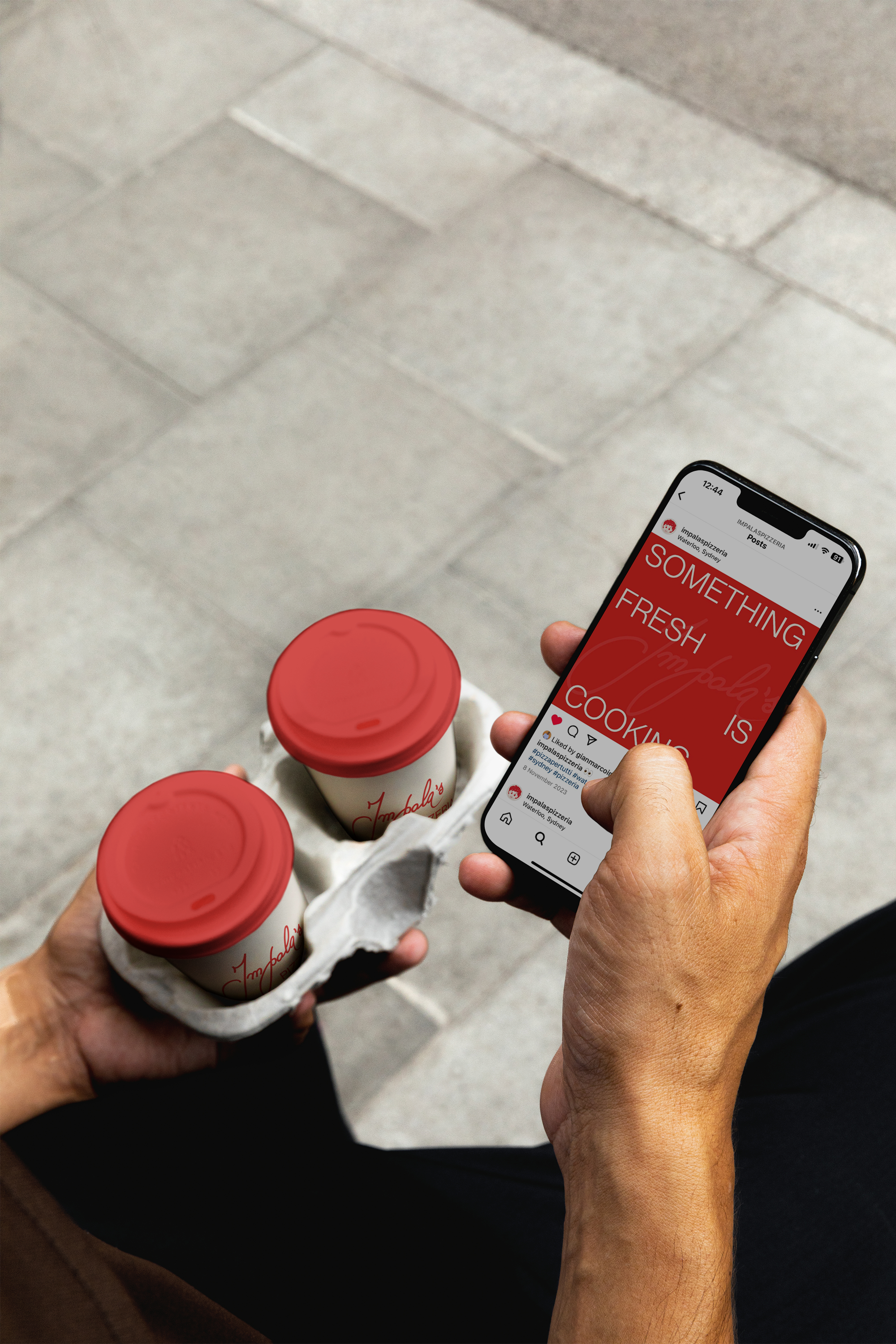
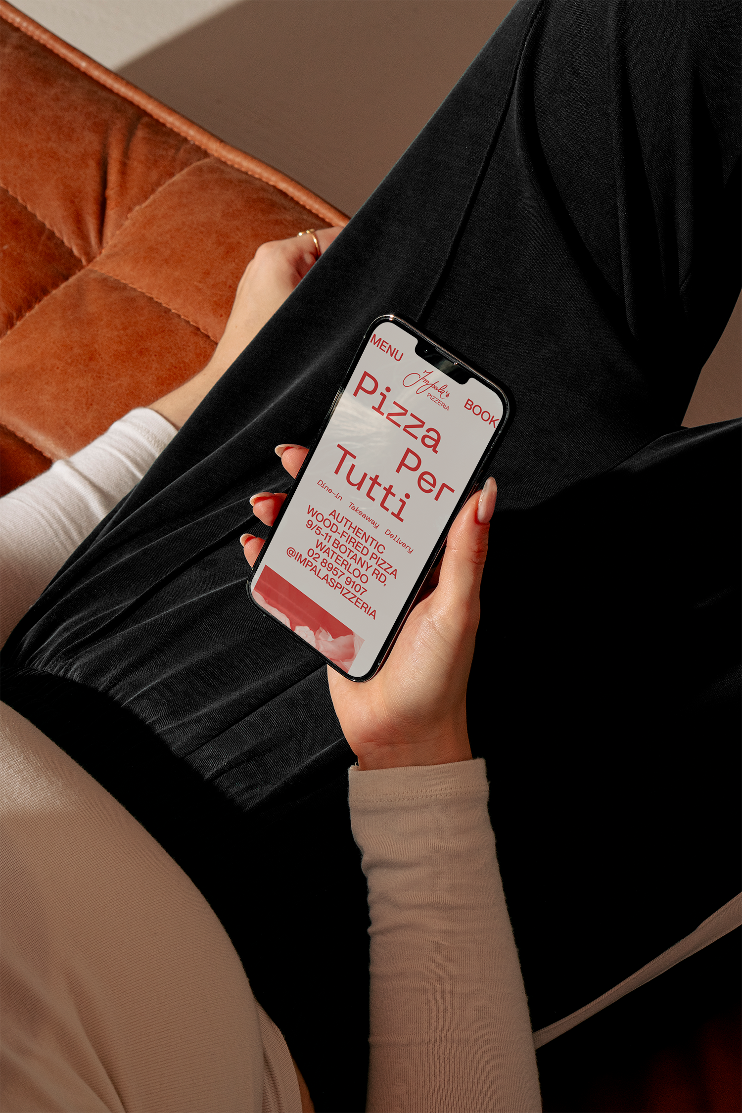
Impala’s Pizzeria is a small family restaurant in Redfern, serving up authentic wood-fired pizzas with a modern twist. Building on an existing logo, I created a complete identity that sought to hero their logo and their slogan, ‘Pizza per tutti’.
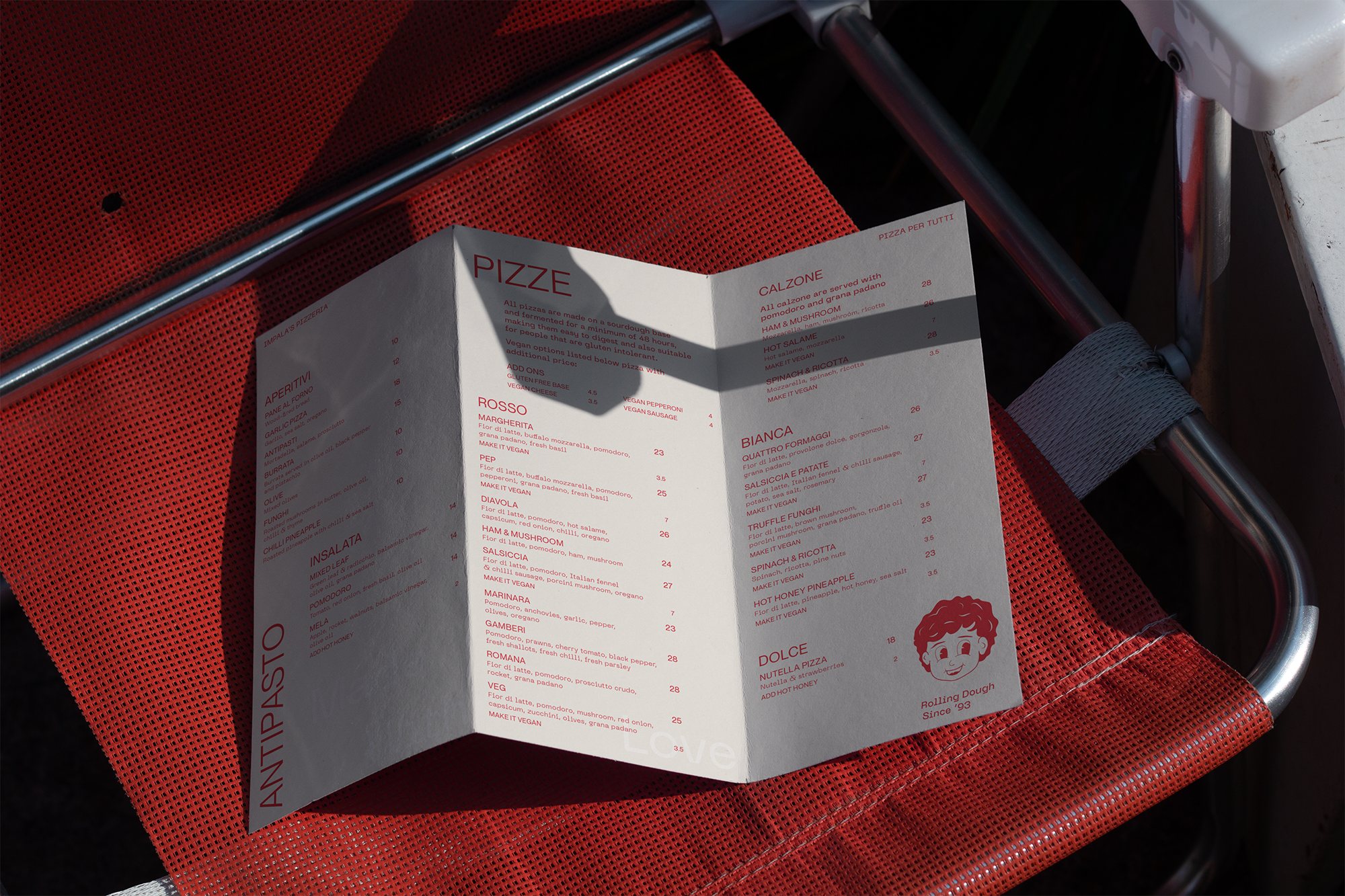
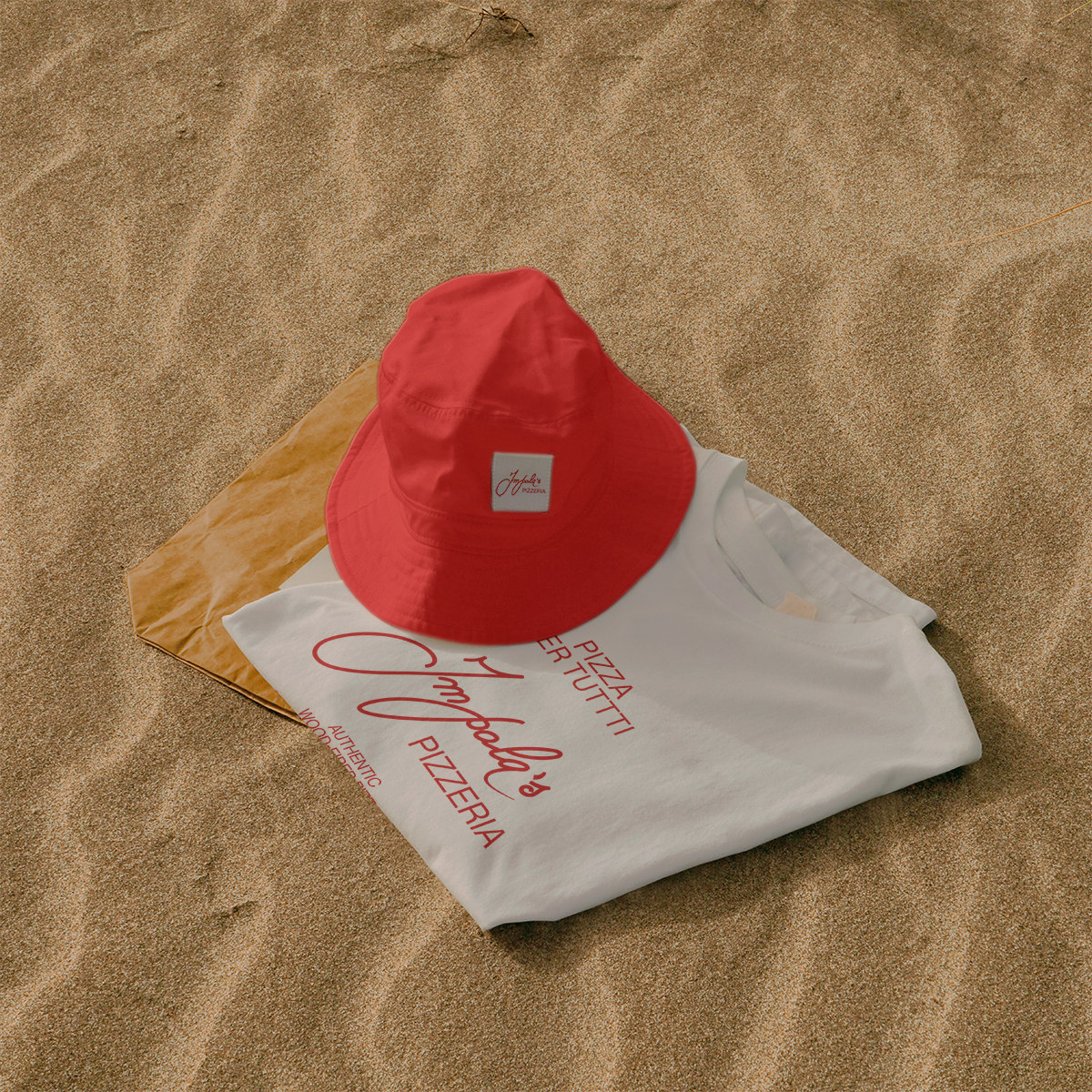
Inspired by the simple ingredients used to create their signature sourdough pizza bases, the new brand is typographic focused, utilising a bare-bones sans serif to create a brutalist identity, complementing the existing script logo. The idenity plays with scale and repetition of the logo and type, creating a multitude of combinations from these simple elements,
just like their pizza recipes.
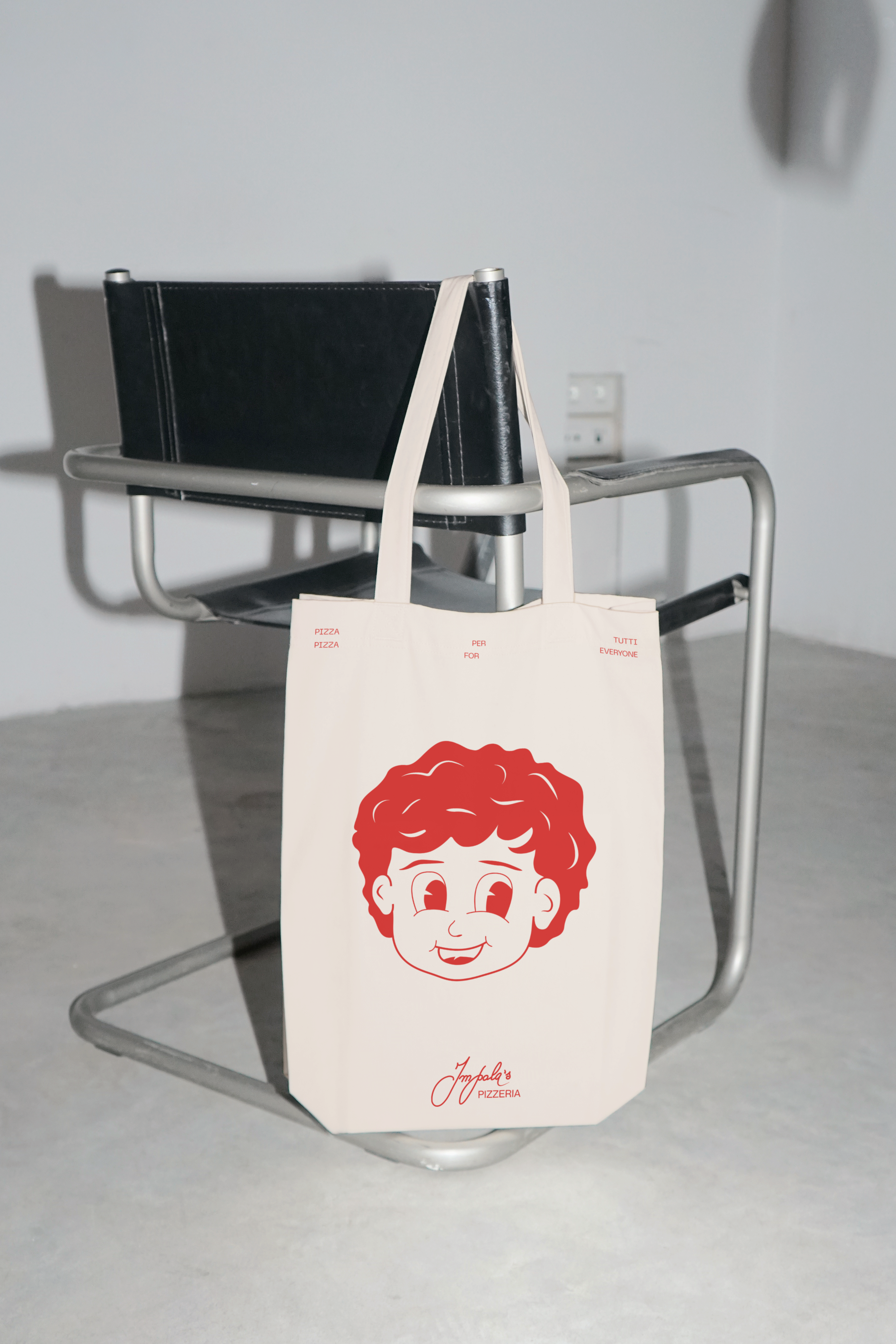
I also created a mascot illustration from a historical photo of the owner Gianmarco, who began making pizza in his family restaurant at 2 years old. The mascot is used to add a human element to brand, contrasting against the brutalist type elements.
